Creating a cover for your horse book is part art, part science and part winging it. In my online course, Aspiring Author Jumpstart, we spend significant time discussing the importance of not designing your own book cover unless you are indeed a graphic designer. Like it or not, even though we say, "Don't judge a book by its cover," we all do, all the time.
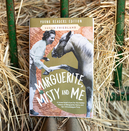
Book covers need to be compelling and eye-catching if you want readers to dive in. I'm going to share a little background on my book cover for my young reader adaptation of my Marguerite Henry biography, Marguerite, Misty and Me.
First, it's super duper important that you study the book covers of books in your same genre. Bonus points if you study the covers of bestsellers in your genre. When I knew I was going to be paring down my OG Marguerite, Misty and Me, I started looking for middle grade books that were adaptations based on nonfiction biographies or memoirs. I bought the young reader adaptations of the following books: It's Trevor Noah, I am Malala, The Boy Who Harnessed the Wind and The Eighty Dollar Champion.

I studied the fonts, colors and even the way the books were described as "Young Readers Edition," etc. I also spent time at my local indie bookstore perusing the shelves of the middle grade books. I noticed a theme of bright colors—blues and turquoises seemed to dominate. I thought back to my days teaching middle school and how students LOVED blues. Always.
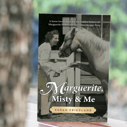
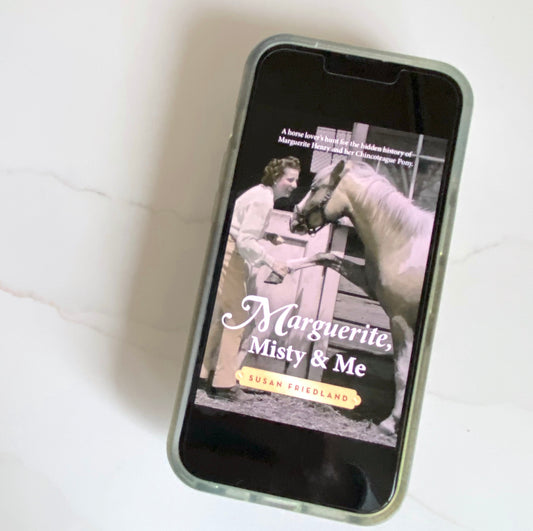
I knew from studying these young reader adaptations that my cover for the middle grade Marguerite, Misty and Me needed to be very close to the original, but with a twist.
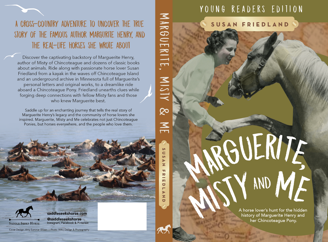
I also knew that the most captivating part of the whole Marguerite and Misty story is the Chincoteague Pony swim. I wanted to have that as part of the vibe too. I actually requested to have swimming ponies on the cover. My cover designer did not comply. lol And now I'm grateful.
My big asks for this young reader version was a fun title font, the color blue and swimming ponies. When I received the first mock up cover I loved the big font, loved the map (because so much of my story occurs on travel adventure and I loved the rust and green colors because rust is hot right now (and it reminds me of riding breeches) and green is my favorite color. But where was the blue?????
I set off to my local library with a printout of the mockup to find actual young readers and see what they thought about this cover.
A children's librarian (who is actually a family friend from days of yore) greeted me and I showed her the cover. She said that it's popular right now for book designers to create "vintage" looking covers, but wondered aloud if that was a trend that appealed to the "grown up" designers, but was not child considerate. She was also confused by the partial map on the left of the front cover, wondering if it was a horse shoe. She then ushered me over to three upper elementary age boys.
The boys were sitting in separate areas of the children's section of the library, so I don't believe they heard the feedback from the other kids.
"Susan is an author, and she wants to know what you think of this cover for a book that is going to come out," the librarian said.
"You won't hurt my feelings if you don't like it. I need your honest opinion," I added.
The first boy's eyes got big, and he said "Cool!" or some other similar word and that he liked it because green was his favorite color. I asked what he noticed and he mentioned the map (he didn't think it was a horse shoe!).
The next boy burst out, "So cute! She's shaking the pony's hand." And he thought the swimming ponies on the back were interesting.
The third boy had a similar response. All three boys thought the cover looked sharp and realized the map was a map and they felt like it had an adventure vibe.
I was a little sad there were no little girls in the library that day, but I thought boys would be a tougher audience, so I was glad to have their approval.
Even though this cover is not what I would have dreamed up, I love the cover design on front and back and believe that it does a great job of telling the story through art and images.
What do you think? If you're an author too, how do you go about creating covers? Have you reached out for reader input? Leave a comment and share your story. If you are traditionally published, what input are you allowed to provide for your cover design?


1 comment
Covers are so difficult for me. Even when I pay tons of money for a professional to do it, I always second guess. I have an art background and sometimes make my own and then am convinced that they’re losing me tons of money in sales bc no one should do their own cover 😂🫠. Being an author is hard.
But either way, I LOVE your covers and so does my horse crazy opinionated daughter.